Posted At: May 16, 2024 - 461 Views

When creating a website, it’s essential to keep the user in mind. Great user interface (UI) and user experience (UX) design make sites enjoyable and easy for visitors, keeping them interested and engaged. If you're looking to create a memorable app or website, you’ll want to know about the top UI/UX trends that are making waves!
These latest UI/UX trends will help you build a site that’s easy to use, visually impressive, and highly engaging. Ready for a website makeover that will wow your visitors? Let’s go through these trends one by one!
Do you want to build an App or a website that wows visitors?
Look no further than these hot UX/UI trends in 2024! From cool tricks like immersive scrolling and bold colours to futuristic tech like AR/VR and AI-powered design, there's something here for everyone.
Think of it like giving your website a makeover – one that will make it super user-friendly, visually stunning, and engaging. And the best part? These trends are all about creating a positive experience for your visitors, which means they're more likely to stick around and become loyal fans (or customers!).
So what are you waiting for? Dive into these trends and get ready to create an out-of-this-world awesome website!
1. Immersive Scrolling!
Imagine you can control exactly what visitors see on your site, and how they see it. That's the magic of immersive scrolling. Think of it like storytelling with scrolling! You get to show off your content in a cool, strategic way that keeps people hooked.
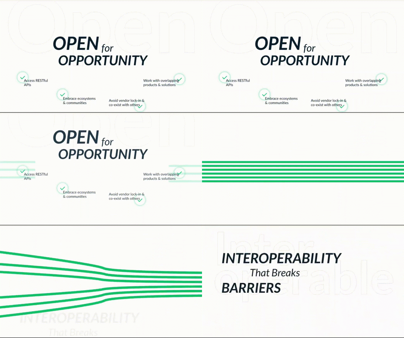
Here's the deal: smooth animations, dynamic elements – all this cool stuff works together with your regular website things to grab visitors' attention. It's like putting on a website magic show! They'll be so curious, they'll want to explore everything you have to offer, even the stuff they might normally skip.
This is a hot trend for 2024, but remember, it's not a one-size-fits-all situation. Make sure this fancy scrolling thing fits your business and helps you reach your marketing goals. Think of it like picking an outfit – gotta match your brand, you know?
2. Bold and Beautiful Colors!
Get ready for a blast from the past! Bold colours and retro vibes are totally in for 2024. Remember those awesome colours and patterns that rocked the 70s, 80s, 90s, and Y2K? Yeah, those are coming back in a big way for websites.
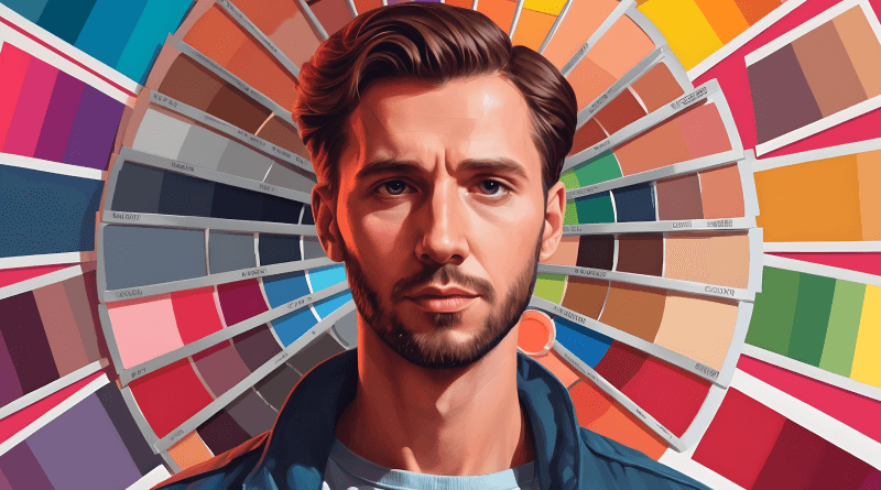
We're talking bold contrasts, eye-catching gradients – all that good stuff. Gradients are like adding shimmer to your website colours, making them move and come alive. Done right, they'll grab attention and make even plain-looking things feel exciting.
And since retro is hot, expect to see bright neons popping against calmer colours. Think of it like a colour party on your website! These nostalgic colour schemes add personality and draw people in. Don't miss out on this fun UX trend!
3. 3D and Animation Extravaganza!
Want to make your website stand out from the crowd? Throw in some 3D graphics and animations! These cool moving elements will add pizazz to your static content, just like immersive scrolling. It's like adding motion to pictures in a history book – way more engaging, right?
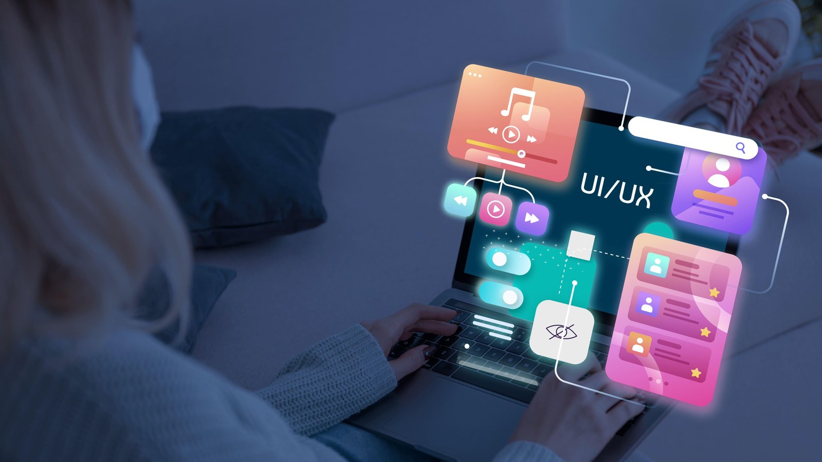
3D elements also make your site more interactive and memorable for visitors. Imagine a website that feels like a whole new world to explore! That's the power of 3D done right. But here's the thing: don't go overboard! These 3D graphics and animations should be like sprinkles on your website cupcake – tasty and fun, but not the main course. If you use too many, it can overwhelm visitors and make your site confusing.
The key is to use them strategically to highlight important content and create a unique, positive experience for visitors. When done well, 3D and animation can take your website from drab to fab!
4. AR/VR – The Future is Here!
Imagine letting visitors explore your products in a whole new way! That's the magic of AR and VR. These technologies have been around for a while, but they're finally becoming more affordable and accessible for businesses.
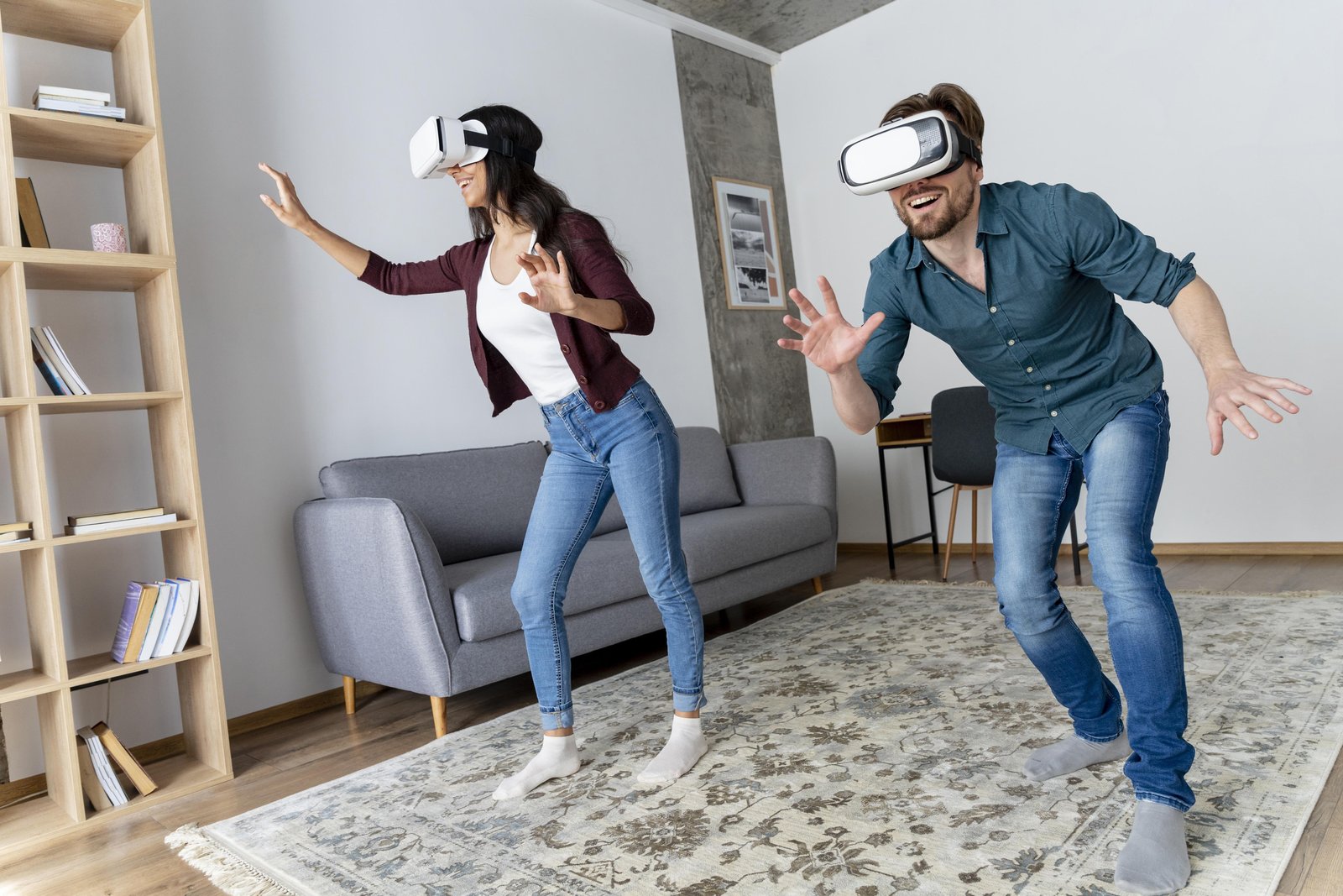
AR stands for Augmented Reality. Think of it as taking the real world and adding cool computer-generated graphics and sounds on top. VR, or Virtual Reality, creates a completely simulated environment using a computer.
Both AR and VR are amazing for creating immersive experiences for customers. For example, imagine a furniture store where you can use AR to see how a couch would look in your living room before you buy it! Talk about convenience!
AR and VR are already being used in tons of fields, like education, shopping, and even healthcare. And in 2024, we expect to see them take off in website design too. It'll be a whole new way for people to interact with your brand!
5. Kinetic Typography – Text with a Kick!
Ever seen text that moves on a website? That's kinetic typography, and it's a hot trend for 2024. Imagine your website headlines and text with a little extra pizazz – that's what kinetic typography brings to the table.
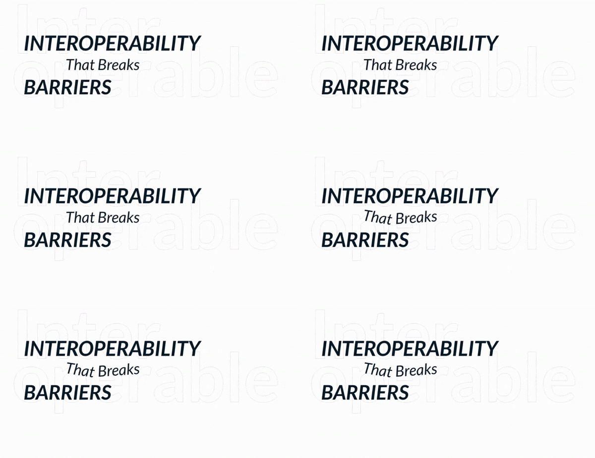
It's a cool way to grab visitors' attention, set the mood for your site, and get your message across in a fun and engaging way. And the best part? It doesn't have to be super complicated! Even a simple animation where text slides in as visitors scroll can make a big difference.
Kinetic typography is also a great way to make important points stand out from the rest of your text. It's like giving those key points a little spotlight!
6. Gamification!
Imagine turning your website into a game! That's the idea behind gamification. It's all about adding interactive elements that make using your site feel more like fun and games, not a boring chore.

Think of apps like Duolingo – they use a game-like format with levels and challenges to help you learn a language. Gamification can do the same thing for your website!
Here's how it works: you add things like badges, rewards, challenges, and even quizzes to your site. These interactive elements keep visitors engaged and make them want to keep exploring. It's a win-win! Visitors have fun, and you get valuable information from them, like contact details and preferences.
7. Bento Box Design – Keeping Things Organized in Style
Have you ever seen those beautiful Japanese bento boxes where everything fits together perfectly? Well, that's the inspiration behind bento box design for websites!
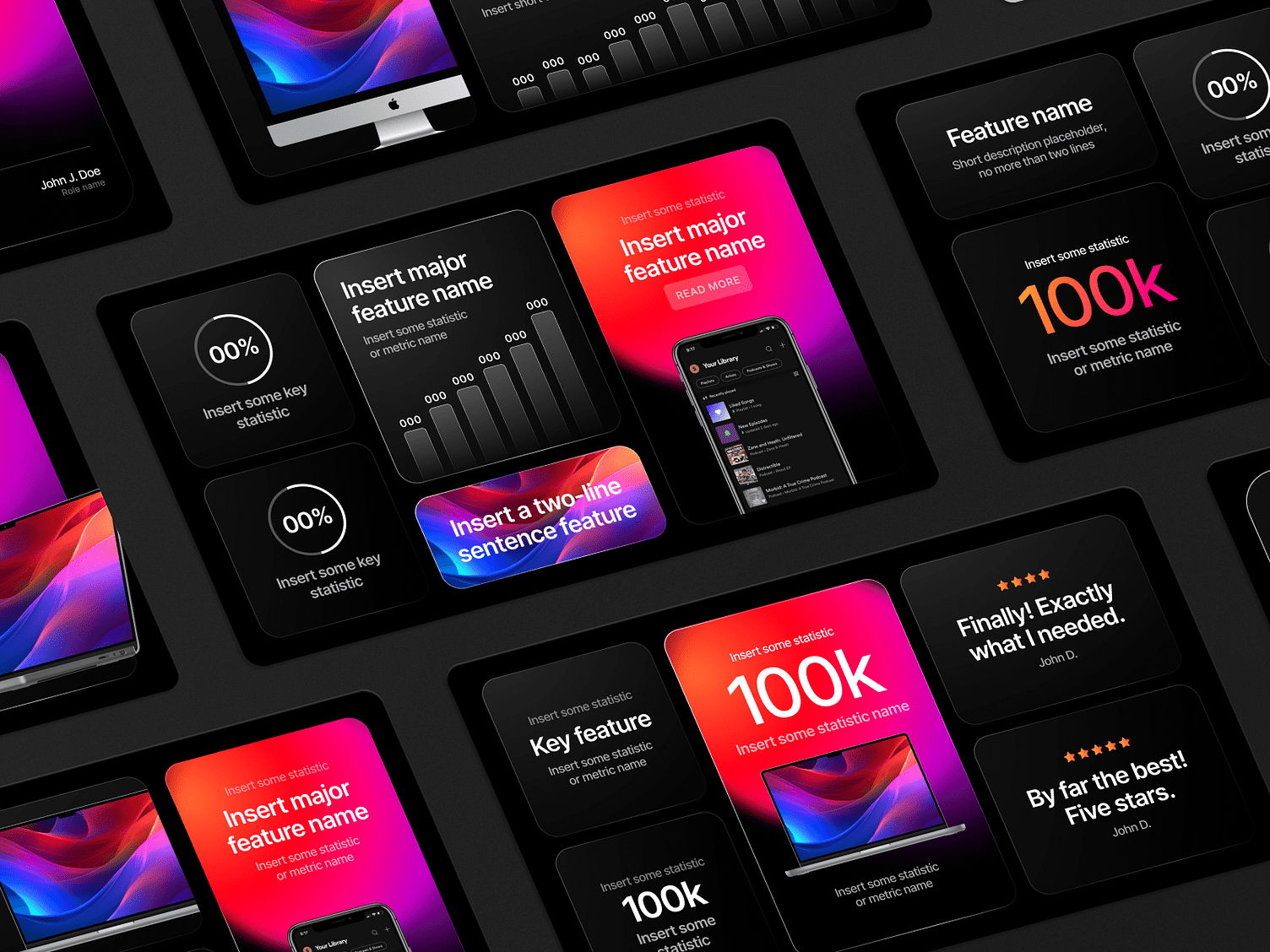
It's all about organizing your website content into clear, defined sections that fit together seamlessly. Think of it like creating a visually pleasing puzzle on your site. This keeps things modern, organized, and super easy for visitors to navigate.
Bento box design is a great way to make your website content more eye-catching. In 2024 and beyond, expect to see more and more sites using this trendy and functional design style.
8. Generative Design – AI to the Rescue!
Ever seen that mind-blowing AI art online? Imagine using that same technology to create a user-friendly website! That's the magic of generative design.
As AI gets more powerful, it's becoming a popular tool for designing websites. Instead of spending hours manually crafting your site, you can use AI tools to help with everything from formatting and picking icons to even creating content!
Now, AI isn't here to replace human designers completely. But it can definitely be a super helpful assistant, speeding up the design process. If you're curious about generative design, there are a bunch of cool tools out there to try, like Kartiv, an AI web design generator, SplashAI for creating images, and Brand Mark, which can help with colour schemes and branding. These tools can help you keep up with the latest UX trends and lighten the load for your design team.
9. Microinteractions – The Tiny Details That Make a Big Difference!
Microinteractions might sound small, but they have a big impact on your website's user experience (UX). Imagine tiny animations that help visitors navigate your site and give them feedback. Pretty cool, right?
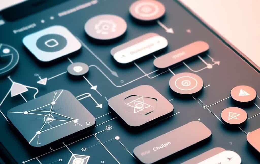
These microinteractions can be super simple, like text that highlights when you hover over it with your mouse. Or maybe it's a fun emoji that pops up when you like something. Even a loading icon that appears after you submit a form can be a microinteraction.
The more attention you pay to these tiny details, the better your website's UX will be. Microinteractions are like little helpers that make your site more enjoyable to use. They guide users, keep them engaged, and show them that you care about their experience. So don't forget the power of these little details!
FAQ: Frequently Asked Questions;
1. Why are UX/UI trends important?
By following the latest UX/UI trends, you can create a website that is more user-friendly, engaging, and memorable for visitors. This can lead to higher conversion rates, more sales, and a better overall brand experience.
2. Do I have to follow all of these trends?
No, you don't have to follow all of the trends listed in this blog. The best approach is to choose the trends that are most relevant to your business and target audience.
3. What is immersive scrolling?
Immersive scrolling uses animations and other visual effects to create a more engaging scrolling experience for website visitors.
4. What colors are trending in 2024?
Bold colours, retro vibes, and bright neons are all on trend for 2024.
5. How can I use 3D and animation effectively on my website?
Use 3D graphics and animations sparingly to highlight important content and create a unique user experience. Don't overdo it, or you risk overwhelming visitors.
6. What is AR and VR?
AR stands for Augmented Reality. It superimposes computer-generated images in the real world. VR stands for Virtual Reality. It creates a completely simulated environment.
7. What is kinetic typography?
Kinetic typography is text that moves on a website. It can be a great way to grab visitors' attention and make your message more engaging.
8. What is gamification?
Gamification is the use of game-like elements in non-game contexts. You can gamify your website by adding things like badges, rewards, challenges, and quizzes.
9. What is bento box design?
Bento box design is a website design style that organizes content into clear, defined sections. It's a great way to make your website content more user-friendly and visually appealing.
10. What is generative design?
Generative design uses artificial intelligence (AI) to create website designs. AI tools can help with everything from formatting and picking icons to even creating content.
11.What are micro-interactions?
Microinteractions are tiny animations or feedback mechanisms that help visitors navigate your website. They can be a great way to improve the user experience (UX) of your website.
By exploring and integrating some of these latest UI/UX trends, you can create a website or app that impresses visitors and keeps them coming back for more!


